Does your home’s exterior feel a little out of tune with Avalon’s trees and ridge lines? You are not alone. In Lenoir City, the light shifts with each season and the hardwoods do most of the color talking, which can make paint choices feel tricky. In this guide, you will learn palettes that fit Avalon’s landscape, finishes that last in our humid climate, and a simple process to pick colors with confidence. Let’s dive in.
Why place-based color wins in Avalon
Avalon sits among mature East Tennessee hardwoods. Summer brings deep greens from oaks and hickories, while fall turns to warm golds, oranges, and reds. In the distance, ridge lines read as cool bluish gray. Your exterior should feel comfortable in that full range so it looks right in July and in January.
Our humid subtropical climate matters too. Warm, damp summers can encourage mildew and stain build-up, especially on shady north sides. Strong sun can fade overly saturated colors and add heat to dark bodies. Picking nature-referencing, moderately saturated tones helps your home blend with the landscape and reduces visible wear.
In practice, that means you focus on earthy neutrals, softened greens, stone-influenced grays, and a few purposeful accents. Pair those with quality exterior acrylic coatings that resist mildew so your hard work holds up.
Palette families that belong here
Below are color families that echo Avalon’s hardwoods, stone, and ridge views. Each one is timeless, market-friendly, and easy to live with.
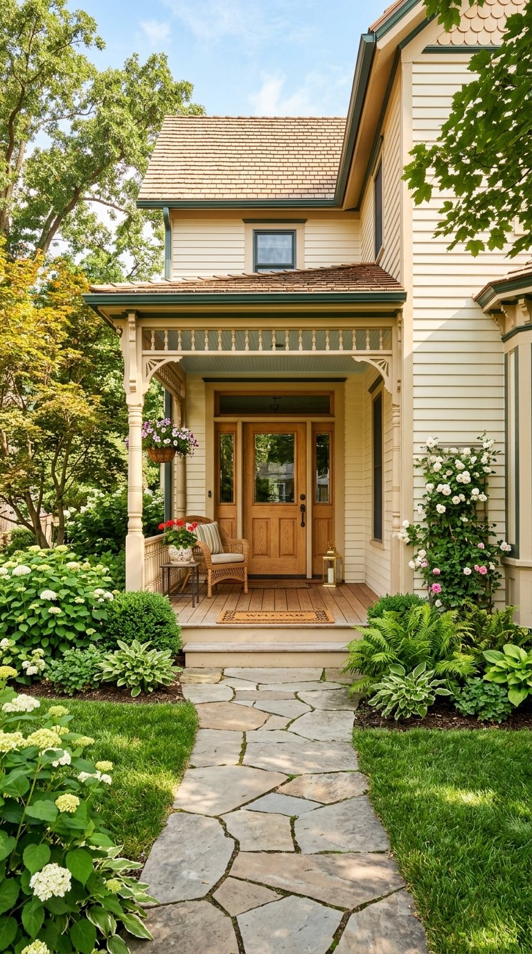
Warm taupes and soft beiges
- Why it works: These hues mimic bark, leaf litter, and mortar, so they sit quietly in a wooded setting.
- Best use: Calm body color that lets landscaping take the lead. Trim can go creamy off-white for a classic look.
Muted olive and gray-green
- Why it works: These colors bridge summer foliage and winter dormancy. They reference moss and understory plants.
- Best use: Body color or secondary elements when you want an unmistakably natural vibe.
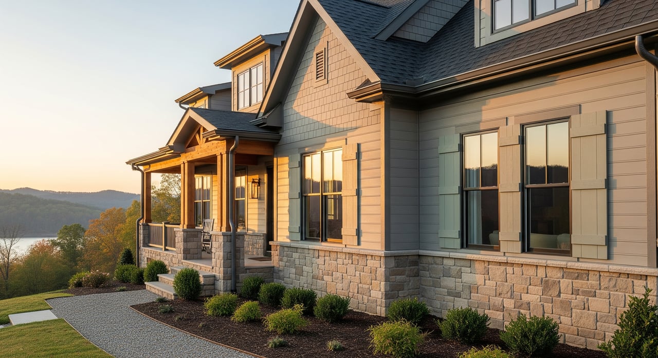
Soft stone grays and greige
- Why it works: They echo local stone and the distant bluish ridge tones. Undertones can run warm or cool for flexibility.
- Best use: Body color that leans modern-traditional. Trim can be cool white for crisp contrast or warm cream for softness.
Clay, terracotta, and warm brick reds
- Why it works: These accents nod to fall leaves and coordinate with brick or fieldstone details.
- Best use: Front doors, shutters, or a small band of accent trim. A little goes a long way.
Deep muted blues and charcoal
- Why it works: These tones reference ridge lines and add visual weight where you want a focal point.
- Best use: Doors, shutters, garage doors, or carefully chosen dormer details.
Four easy palette structures
Picture these combinations on a sunny fall afternoon in Avalon so you can see the harmony.
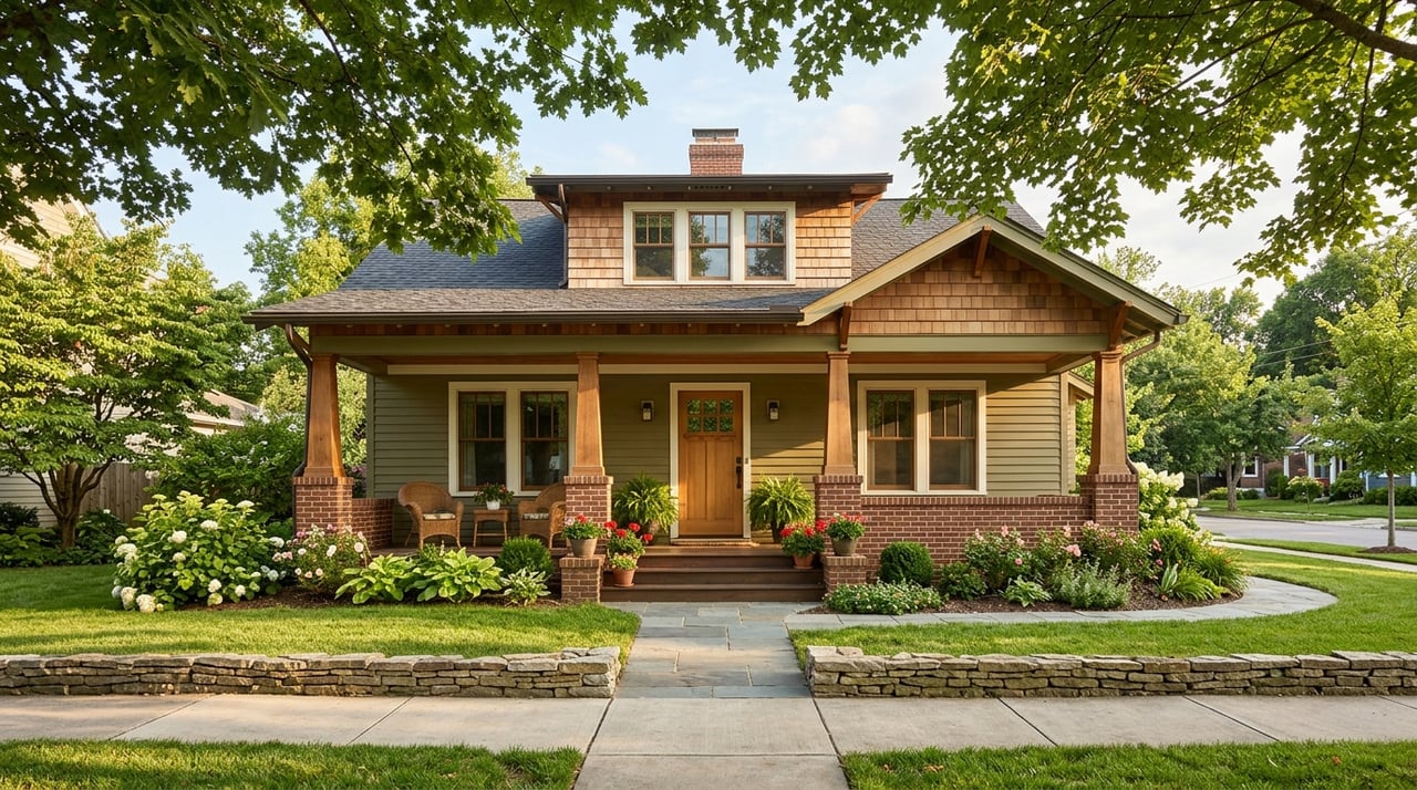
Palette A — Warm Vernacular
- Body: Warm taupe with a soft earth undertone
- Trim: Creamy off-white
- Accent: Deep olive or a muted barn-red door
Palette B — Ridge Harmony
- Body: Soft stone gray or greige with a subtle warm or green undertone
- Trim: Cool white or very pale gray
- Accent: Deep slate blue or charcoal door
Palette C — Woodland Green
- Body: Muted gray-green, like olive softened with gray
- Trim: Warm cream or light tan
- Accent: Terracotta or rich russet door
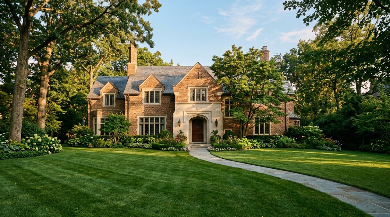
Palette D — Natural Contrast for Brick or Stone
- Body: Warm taupe or light greige to complement red-brown brick
- Trim: Warm white
- Accent: Charcoal or deep navy on the door or garage
Tip: Imagine an olive-gray body, cream trim, and a rust-red front door that nods to fall leaves. That mental image helps you test how a palette reads across seasons.
Match color to your materials
Different exteriors hold and show color differently. Start with what you already have.
Wood siding
- Warmer earth tones complement the grain and look authentic.
- Expect more frequent repainting, often every 5 to 10 years based on exposure and prep quality.
Fiber-cement
- Holds color well and tolerates richer tones.
- Repaint cycles are typically longer, often 10 to 15 years.
Vinyl siding
- Many vinyl colors are molded in. If you plan to paint, use low-sheen acrylic latex designed for exterior use.
- Be cautious with very dark body colors that can absorb heat and risk warping in full sun.
Masonry and stone
- Let natural stone breathe and stay unpainted whenever possible.
- Choose body colors that complement the dominant stone or mortar tone so the whole elevation reads as one.
Finish and sheen choices that last
Finish level influences both appearance and durability.
- Body: Low to medium sheen, like eggshell or satin, hides minor surface flaws and is washable.
- Trim and doors: Semi-gloss or gloss adds durability and is easier to clean.
- Porches and railings: Use products rated for exterior floors and handrails to handle traffic and touch.
For our humid summers, prioritize high-quality 100 percent acrylic exterior paints with mildew resistance. If you love deeper hues for accents or doors, understand that darker colors may fade or wear more quickly, especially on sunny elevations.
Design details that make it intentional
Small decisions help the whole palette feel designed, not accidental.
Trim strategy
- Set your contrast level. Low-contrast body and trim reads calm and integrated. High-contrast reads crisp and architectural.
- Use higher sheen on high-touch trim, like porch rails and door frames, to hold up to daily use.
Front door and focal accents
- The front door is your best place for a saturated color. Consider deep navy, russet, warm olive, terra-cotta, or charcoal.
- Repeat your accent color in small touches like house numbers, a mailbox, or planter finishes.
Porch ceilings with a Southern nod
- A pale blue porch ceiling, sometimes called haint blue, visually opens the space and relates to our bluish ridge horizons.
Roofing, gutters, and downspouts
- Coordinate gutters and downspouts to the trim or body to reduce visual clutter.
- Always consider existing roof color before finalizing the palette so you avoid expensive re-roofing to make the colors work.
Hardscape and planting coordination
- Test paint swatches next to your stone, brick, and pavers in different light.
- Reinforce your palette with plants. Evergreens support gray-green bodies year-round, while native perennials deliver fall tones that echo a terra-cotta door.
Fit the architectural style
- Craftsman, ranch, and farmhouse forms common in Loudon County favor earth tones, muted greens, and warm neutrals.
- Use deeper natural accents for depth without chasing short-lived trends.
A simple process to choose with confidence
Use this clear workflow to reduce rework and keep your project on track.
- Inventory what you have
- Note siding type, brick or stone colors, roof color, and window finishes.
- Check for any Avalon HOA guidelines or Loudon County approvals needed before painting.
- Shortlist palettes and test
- Pick two or three palettes and paint large test patches on different sides of the house.
- Observe morning and afternoon light for a few days. If timing allows, view in more than one season.
- Balance cost and impact
- Exterior painting is a moderate investment with high visual impact. Prioritize the front elevation, entry, and street-facing garage for maximum curb appeal.
- Hire the right pro
- Get at least three local estimates with line items for prep, primer, coats, and trim details.
- Ask about surface prep, primers compatible with your substrate, paint lines used, and any warranty.
- Maintain for the long run
- Plan for typical repaint cycles: wood roughly 5 to 10 years, fiber-cement 10 to 15 years, masonry often longer if left natural.
- Gentle washing extends the life and keeps mildew at bay.
Seller-focused tips to boost showings
- Photograph during soft light to show how the home harmonizes with trees and ridge views.
- Highlight the palette in your listing description if it supports the story of place. For example, say the earth-toned scheme complements native hardwoods.
- Stage with small accents that repeat your door color, like planters or a seasonal wreath, to signal care and cohesion.
Quick recipes for common Avalon scenarios
If you have red or brown brick
- Try a light greige or warm taupe body, warm white trim, and a charcoal or deep navy door.
If you have gray stone or a cooler roof
- Try a soft stone gray body with a cool white trim and a slate blue door to pick up ridge tones.
If your home sits in heavy summer shade
- Choose a slightly lighter or warmer body so it does not feel lost among the trees. Creamy trim adds clarity.
If your home bakes in afternoon sun
- Pick moderately saturated hues to reduce visible fading. Keep deepest tones on the front door or shutters.
If you want a farmhouse-friendly refresh
- Consider a warm beige or muted gray-green body, warm cream trim, and a terra-cotta door for a timeless look.
Ready to make your exterior work for the landscape and your resale? The Foster‑Boline Group can help you position color as part of a full listing strategy and connect you with trusted local pros. Get your free home valuation or schedule a neighborhood consultation.
FAQs
Which exterior colors sell best in Lenoir City’s Avalon neighborhood?
- Neutral earth tones like warm beiges, greiges, and soft stone grays have wide appeal and pair easily with local brick and stone.
Can I paint my home a dark color in Tennessee summers?
- You can, but expect more heat gain and potentially faster fading, so reserve the deepest tones for accents and use high-quality exterior coatings.
How do I coordinate paint with existing brick or stone?
- Identify the dominant undertone of your masonry, then choose a body color with a complementary undertone and trim that provides either subtle warmth or crisp definition.
What sheen should I use for exterior body and trim?
- Use low to medium sheen, like eggshell or satin, for the body and semi-gloss or gloss for trim and doors to balance appearance and durability.
Do I need HOA approval before repainting in Avalon?
- Possibly. Review Avalon’s HOA covenants and check any Loudon County requirements before you finalize colors or hire a painter.